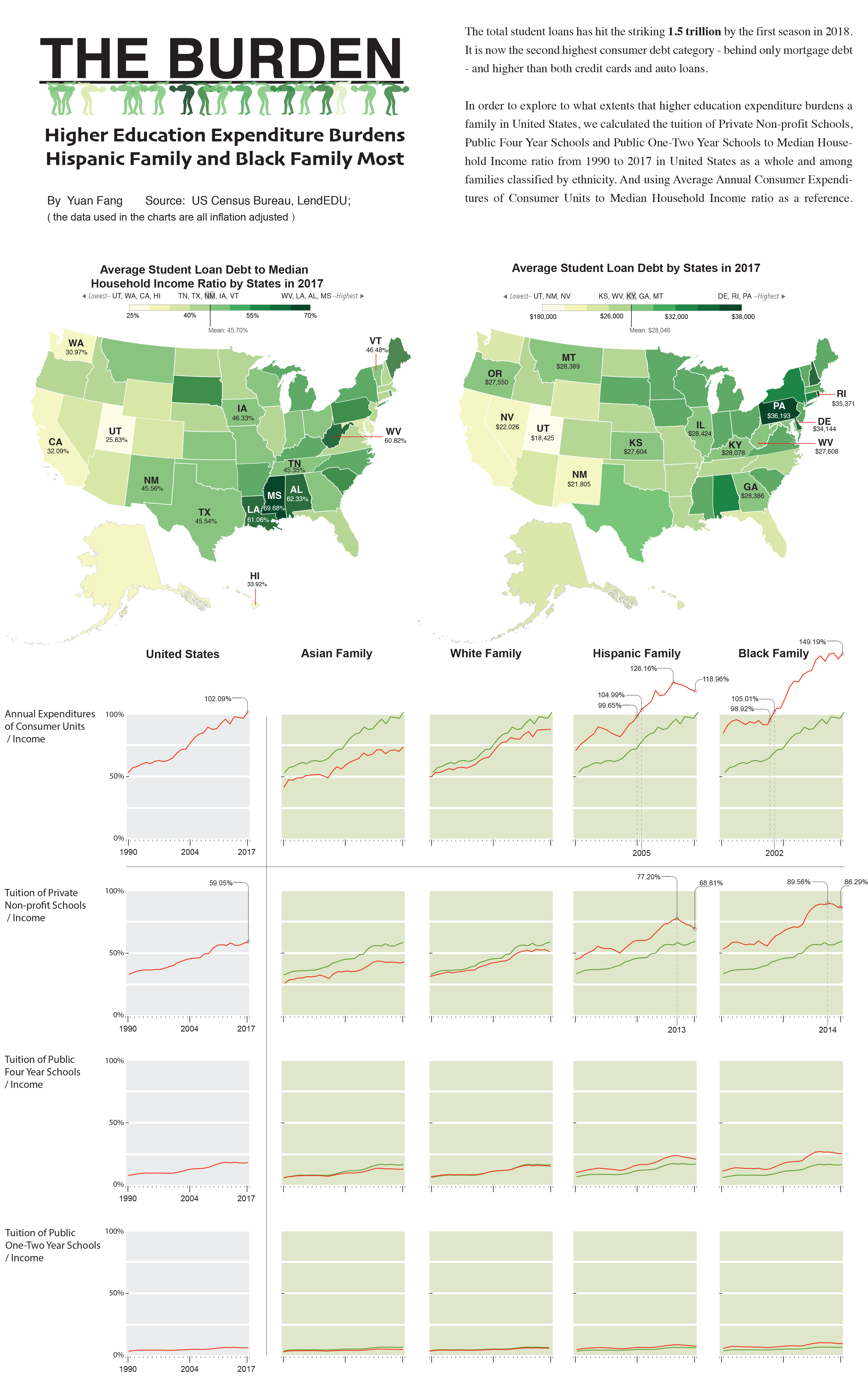
This project was my midterm project of Infographics and Data Visualization (Fall 2018), which general topic was assigned by Professor.
In the process of creating the infographic, my biggest hurdle was, as a foreigner, I couldn’t relate to the issue of “student loan”. The enormous number or percentage highlighted in the news was just making no sense to me. Therefore, the topic that I most wanted to explore was “how to express the data to the audiences like me who didn’t have any background knowledge or experience about ‘student loan’ so they can have the ‘sense’ of what exactly those numbers mean”.